"To see the forest for the trees. Problems can be simpler just by changing how we see them."
I am currently exploring the combined power of beyond-dashboard visualizations and simulation approaches to deliver highly interpretable solutions for business challenges. My study involves approaching solutions from both simulation and visualization perspectives, exploring as many angles as possible. Here are some examples that showcase my learning journey, starting with the simpler ones. I'm enjoying creating these, and I hope to continue adding to them.
I am available for engagements, where I can leverage your expertise to create tailored simulations and visualizations that represent your data, processes, risks and constraints.
Contact me on LinkedIn for a prompt response.
Or email me at: barecasco@gmail.com
Plotly
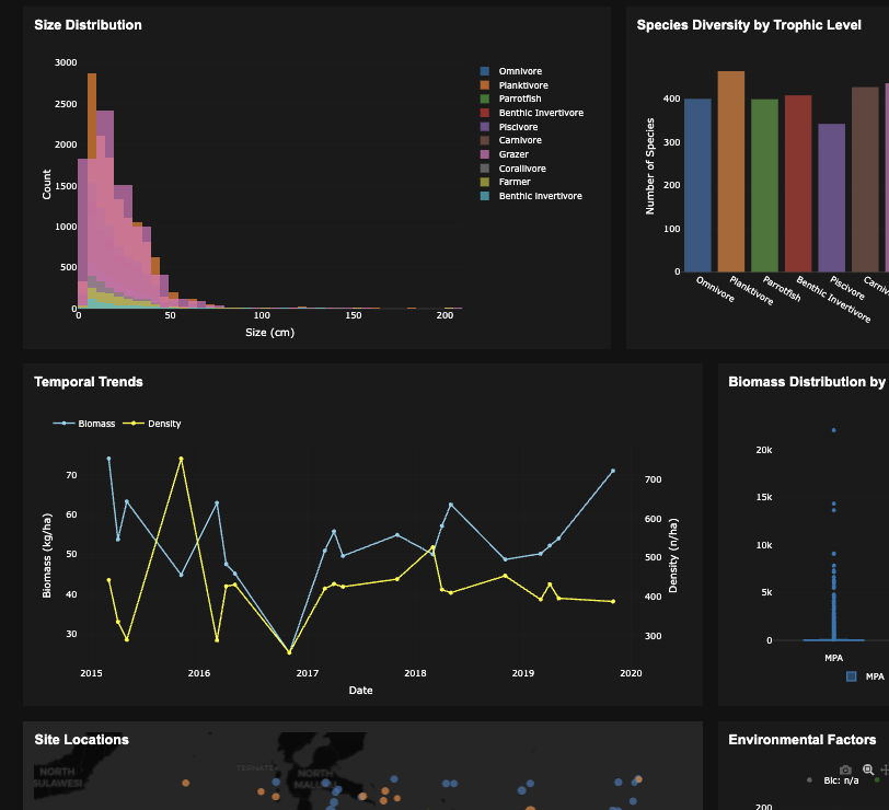
A regular dashboard example leveraging the power of Plotly.
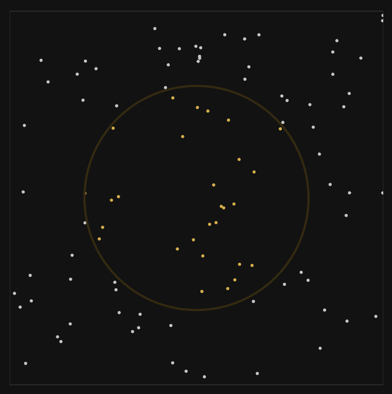
Interactive simulation showing how random sampling can estimate π using geometric probability.

Visualizing how Monte Carlo methods converge to true values with increasing sample size.
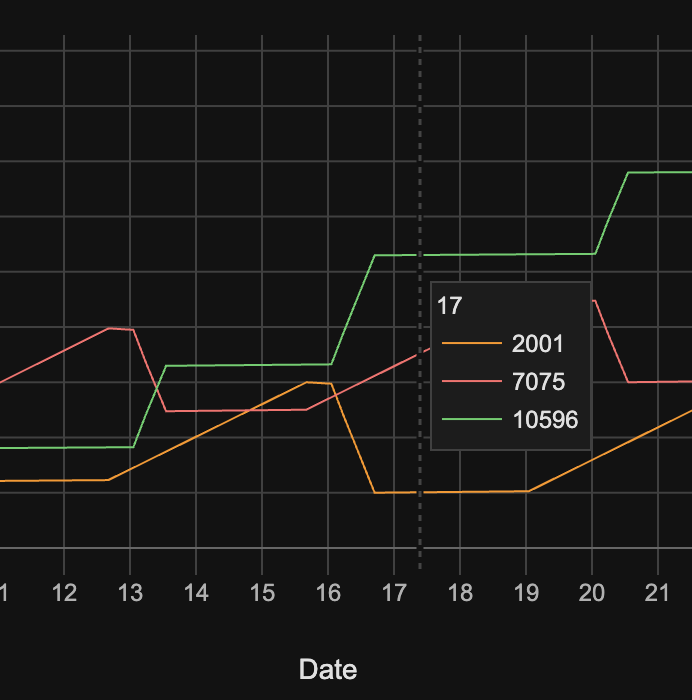
Discrete event simulation for delivery optimization scenarios.

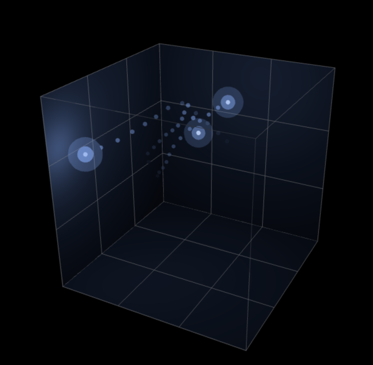
Multi-dimensional data visualization technique for exploring relationships between variables.
Three.js
Can be used for zoning out at work.
It is a computational method that models fluid dynamics by representing fluids as a collection of discrete particles.
HTML5 Canvas

Interactive canvas experience where shapes respond dynamically to user input and movement patterns.
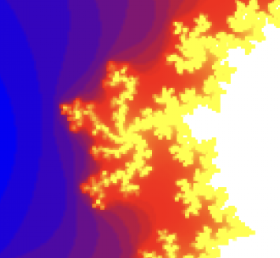
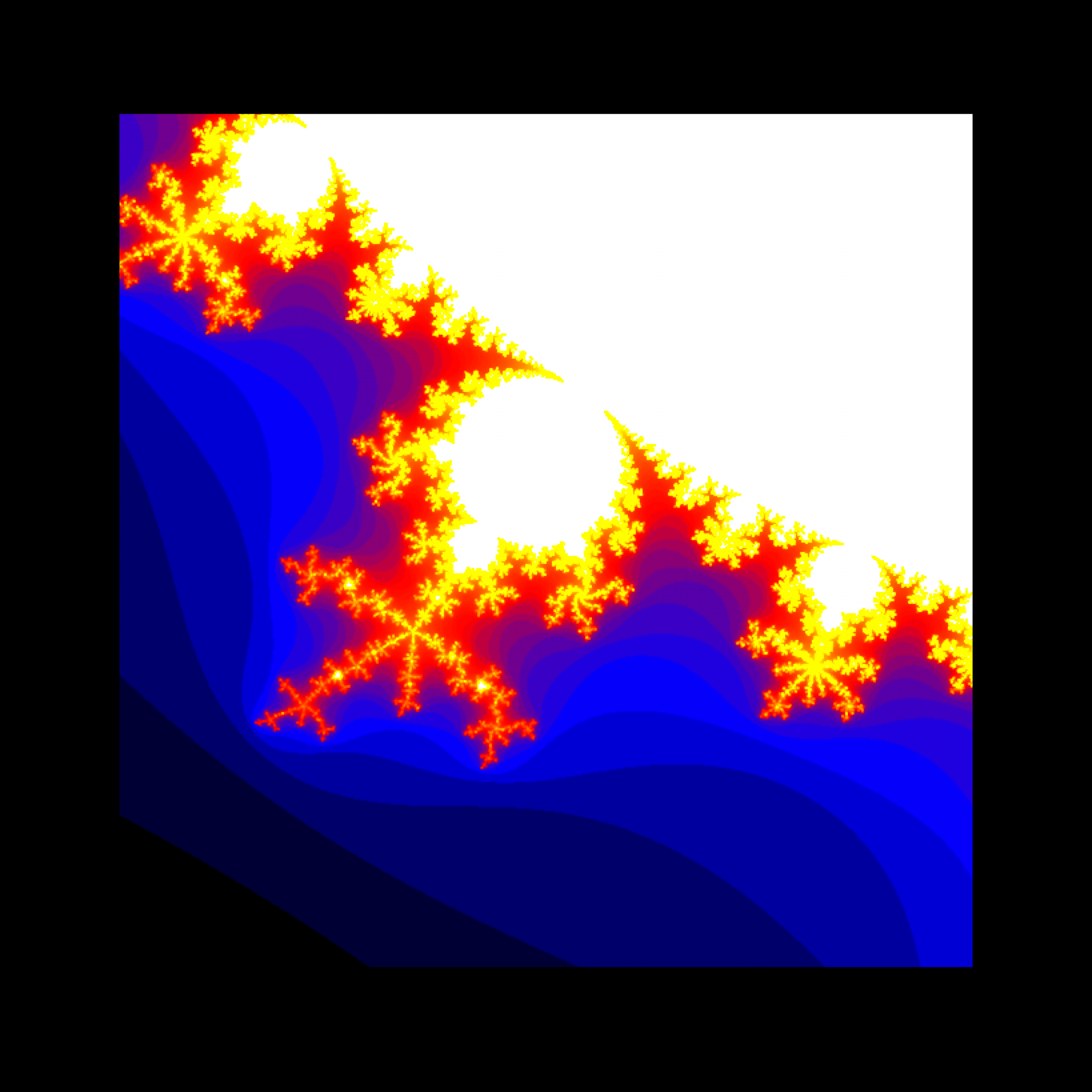
The Mandelbrot plot is a fractal generated by repeatedly applying a simple mathematical equation to complex numbers. Drawn using gnuplot.
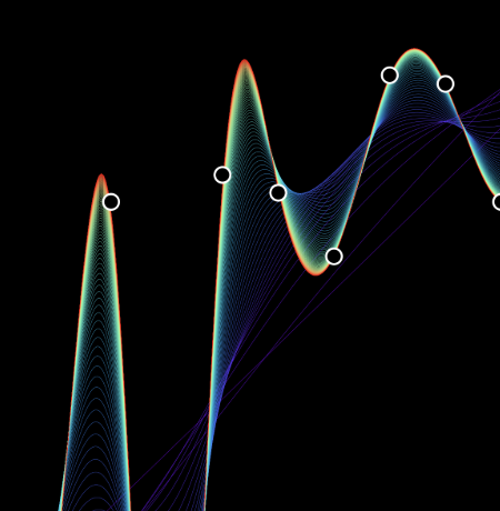
A visualization of curve fitting on a 2D scatter dataset. The plot shows multiple curves with different fit parameters, drawn using gnuplot.
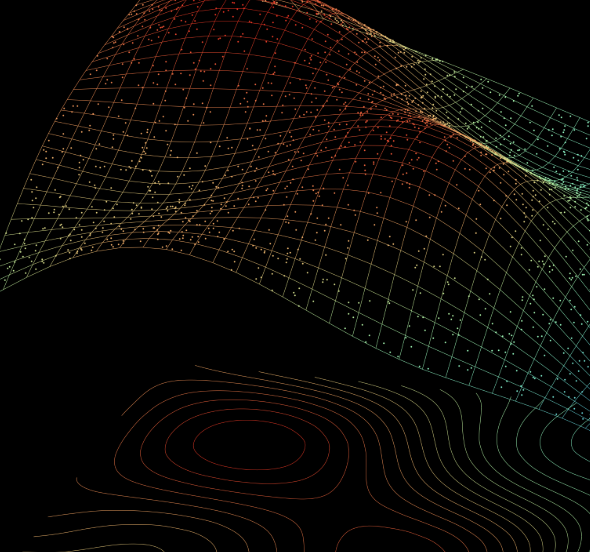
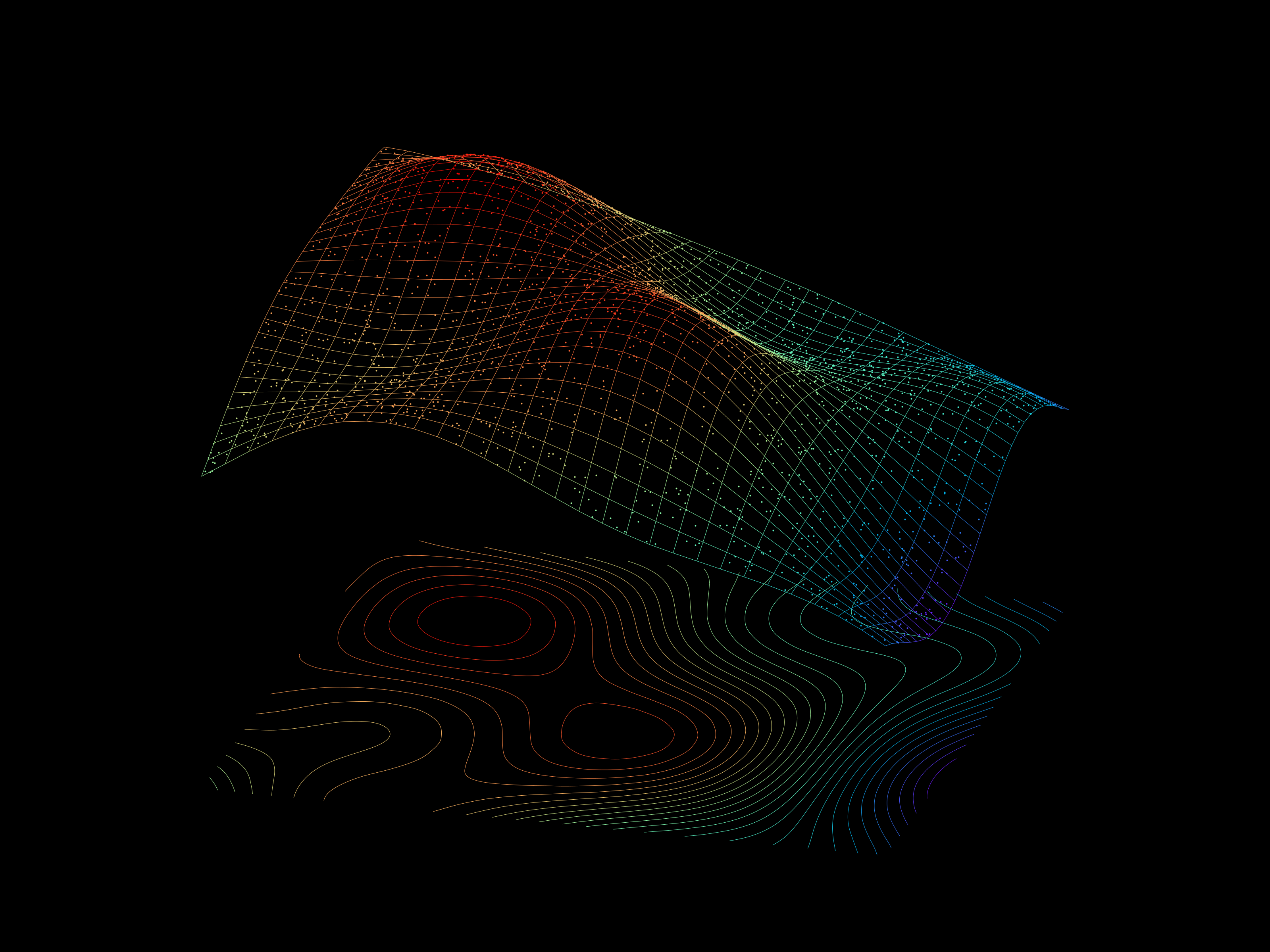
A visualization of curve fitting on a 3D scatter dataset, drawn using gnuplot.
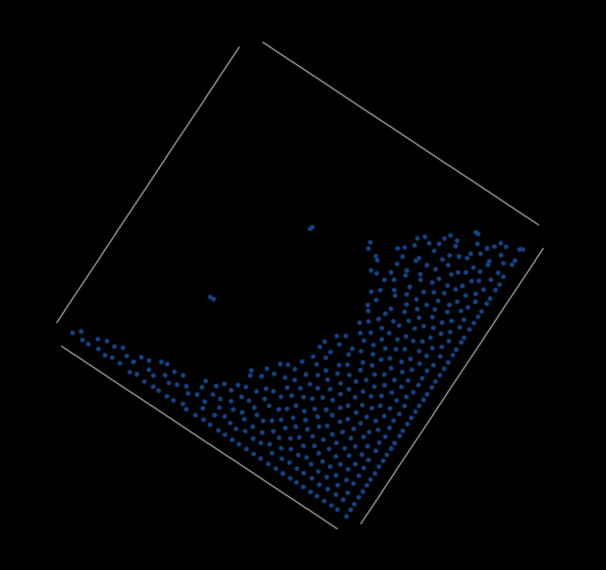
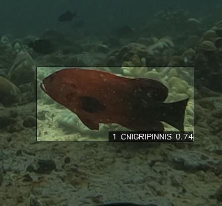
A bounding box visualization that soothes the eyes. Drawn using opencv-python.